


How do you, as an author, design an eye-catching and effective book cover that entices readers to pick up your book? Understanding the fundamental principles of cover design is essential for success in today's competitive market. This guide will walk you through the most important elements of professional book cover design, giving you the knowledge to approach your cover creatively and strategically.
Step by Step to Your Professional Book Cover
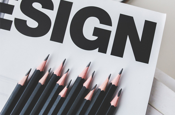
1. The Three Essential Elements of Book Cover Design
There are three key features that play a crucial role in effective book cover design. While some covers focus primarily on one element, the most successful designs thoughtfully combine all three:
Content: The story, theme, or key plot elements are reflected in the cover's visual elements, giving potential readers immediate insight into what they can expect.
Aesthetics: Visual appeal that captures attention through striking design choices, color schemes, typography, or artistic elements that make browsers stop and look.
Craftsmanship: The technical quality and professional execution of the design creates trust and credibility, signaling to readers that the content inside matches the quality of the presentation.
2. Content-Focused Design Example
A content-driven cover immediately communicates the book's essence through its imagery. Consider a cover featuring silhouettes of people running across a landscape with a burning cityscape in the background. Even without reading the title, viewers instantly understand they're looking at a story involving escape, danger, or survival.
This type of design works because it tells a visual story. The figures running toward the edge of the frame suggest urgency and movement. The burning city creates context for the danger they're fleeing. The color palette reinforces the mood - warm oranges and reds suggesting fire and danger, contrasted with stark blacks and whites that emphasize the dramatic tension.
This approach is particularly effective for genres like thriller, adventure, or dystopian fiction where the central conflict or setting can be powerfully conveyed through imagery.
3. Aesthetics-Focused Design Example
An aesthetically-driven cover prioritizes visual impact over literal representation of the story. Imagine a minimalist design with a clean white background and bold black typography as the primary visual element. Rather than illustrations or photographs, the design relies entirely on the power of contrast and typography to create appeal.
The book title might use varying font sizes to create visual hierarchy and meaning. For instance, if the title contained contrasting concepts, the typography itself could reflect this tension - perhaps with one word appearing solid and strong while another appears fragmented or unstable.
This minimalist approach can be incredibly effective because it stands out among busy, image-heavy covers. The simplicity draws the eye, while sophisticated typography choices communicate professionalism and literary quality.
4. Craftsmanship-Focused Design Example
A craftsmanship-focused cover showcases technical skill and artistic sophistication. Picture a complex photomontage showing a lone figure standing on a platform, gazing at a distant city skyline. The image combines multiple photographic elements seamlessly - the figure, the platform, the cityscape, and atmospheric elements all blended into a cohesive, dreamlike composition.
The technical execution is evident in how the lighting matches across all elements, how shadows and highlights create depth, and how the color grading unifies disparate source images. A subtle shadow might suggest foreboding themes, while bright sky elements could represent hope or aspiration.
This level of sophisticated image manipulation requires advanced skills but creates covers that feel cinematic and professional. The complexity invites closer examination and suggests the depth readers might find within the book itself.
5. Your Book Cover as a Canvas
When you're ready to design your book cover, think of it as a blank canvas waiting for your creative vision. Regardless of which design tools you use, the principles remain the same. You'll need to consider how each element works together to create a cohesive, compelling whole.
Start by gathering your essential elements: your name as the author, the book title, any subtitle or genre designation, and your chosen visual elements whether photographs, illustrations, or purely typographic designs.
6. Planning Your Cover Elements
Let's walk through designing a cover for an adventure novel. Suppose you have a landscape photograph featuring a mysterious seascape with mountains and an expansive sky. This image offers both aesthetic appeal through its colors and composition, and content relevance as it could represent the story's setting.
The photograph provides natural divisions - sky, sea, and land - that can help organize your text elements. The expansive sky area might work well for author names, while the more detailed lower portion could accommodate titles or other elements.
7. Strategic Use of Visual Elements
When incorporating your main visual element, consider how it can serve multiple purposes. A landscape photograph used as a background should complement rather than compete with your text. Look for areas of visual calm where text can be easily read, and areas of interest that can enhance your message.
The horizon line in a seascape, for example, provides a natural division that can help organize information hierarchically. Calmer areas like sky or water can accommodate text, while more detailed areas add visual interest without overwhelming the cover's communication goals.
8. Title Placement and Typography
Consider how individual letters or words in your title might interact with your visual elements. If your book is called "The Quest," you might emphasize certain letters that have visual appeal or symbolic meaning. The letter Q, with its distinctive shape, could serve as both a typographic element and a design feature that echoes other elements in your image.
Think about how letters might visually connect with your background - could a curved letter echo the shape of a wave or cloud? Can the typography itself become part of the storytelling?
9. Creating Visual Hierarchy
The arrangement of text elements should guide the reader's eye in a logical order while creating visual interest. Your title is typically the most important element and should receive the strongest visual emphasis. The author name, while important, often takes secondary visual priority unless you're an established author with strong name recognition.
Consider breaking conventional layouts if it serves your design goals. Sometimes placing elements in unexpected positions can create intrigue and memorability, as long as the cover remains readable and professional.
10. Adding Supporting Information
Genre indicators, subtitles, or other supporting text should be clearly visible but not compete with your primary elements. These secondary elements often work best in areas of visual calm in your design.
Consider how supporting text can serve double duty - as information and as design elements that help balance your composition. A thin line extending from a subtitle to the edges of the cover, for example, can provide visual weight and help frame other elements.
11. Bringing It All Together
A successful book cover seamlessly integrates content, aesthetics, and craftsmanship to create something greater than the sum of its parts. Your cover should immediately communicate genre and mood, attract attention in thumbnail size, and maintain appeal when viewed full-size.
The typography should complement your visual elements, the colors should work harmoniously, and every element should contribute to the overall message you want to convey about your book.
Tools and Next Steps
Book covers can be created using various software options, from professional design programs to more accessible tools like presentation software or online design platforms. The key is understanding these fundamental principles regardless of which tools you use.
Remember, your book cover is often the first and sometimes only chance to make an impression on potential readers. Investing time and thought into creating a professional, appealing cover is one of the most important marketing decisions you can make as an author.
Whether you choose to design your cover yourself or work with professional designers, understanding these three essential elements - content, aesthetics, and craftsmanship - will help you create a cover that truly represents your work and attracts your ideal readers.
Add to Conversation